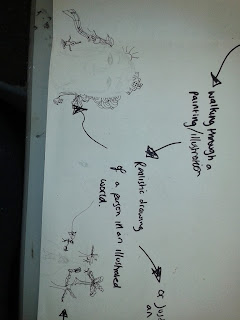
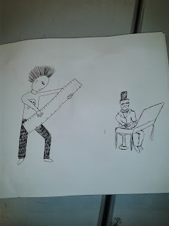
Next to get all my ideas down together and clearly I did a big brainstorm on a big sheet of paper. Here are some close ups of some of the ideas:
Then I started to work back in my sketchbook and developed on my ideas.
Then I googled instruments and decided to draw some to help give me ideas of what I could possibly change them into.
Next I was thinking about the different facial expressions or style her face will be in.
Then I thought i would have a go drawing her with the stand in front of her to make it more obvious that she was playing an instrument but I don't really think that it is needed.
Next I decided to test out other character ideas but think I prefer the girl on the pencil flute the most.
Next I then thought I would try out some inks and see what kinda of effects they would give towards the illustration. I was using inks in my visual language lesson to create my jelly fish and thought it created a nice looking effect so thought I would give it a go for these.
With this image below I thought it would look good to have the ink bursting from the instrument to symbolise art exploding when she plays the instrument. Then after drew a sketchbook underneath to suggest her art work she creates but I'm not really sure if the sketchbook is needed in this.
Following from the idea of the art exploding out of the instruments I used inspiration from Nanami Cowdroy's work; particularly this piece:
I really like the idea of actually just doing a silhouette of the person on the instrument and then have all the art tools and work all coming out from the person on the instrument.
However I thought that this is too complicate and that I should keep it simple. Also I'm not sure how this would work in a series of 3.
I then had the idea to cut the silhouette out of some coloured card and using the ink idea from earlier to fill in the silhouette.
Though I wasn't too keen on that idea. Carrying on with the idea of using card I used the cut out of the girl in the above piece to create the whole illustration from different coloured cards just using shapes.
I did like the look of that idea but I think its a little too simple. So went back to experimenting with inks and card together. Going back to using the inspiration from the Nanami Cowdroy piece I thought I could still use the card silhouette and have the inks exploding from the inspiration.
I then went onto think that I the image would look better and create a bit more of an impact if the girl was really small in comparison to the inks.
So now I had this idea I began to think about what the format of the piece would be. Keeping in mind that as part of the brief it has to be a minimum of A3 scale.
One of my thoughts was to have to format in three triangular shapes. As I think that it amplifies the effect of the art exploding from the small musician and gets larger and larger.
I next then experimented with inks to get an idea of what colours I could use. And what combinations of colours works well together, as I felt that the pink on its own in my previous ideas looks quite plain and flat on its own.
I then did a sample of what I thought one of the triangles could look like. After doing this sample I realised that they look better by still having some more white background as it looks a better contrast and with the colour covering the entire triangle it looks too much.
Moreover, I went onto doing an idea of what they could possibly look like together in a 3 taking on board to still keep a bit of white background. Also even though the musicians were drawn in pen I think that I will cut them out of card and I think that black would work best as it creates a good contrast from the inks.
I'm still not sure if I feel I should have something relating to art on the other side of the ink explosion so just drew out some rough thoughts.
Then thought of the idea of subtly adding a sketchbook into the inks using different paper.
I carried on playing with the format of the piece.
However I decided after trying out the format of the triangular shape that I wasnt actually keen on this format.
These are my overall finished pieces.
We then presented our work up on the walls and placed a piece of paper next to it and put a line down the middle one side with a drawing of an eye on it representing visual and on the other side a light bulb illustrating the idea. Then people went round the class and writing there thoughts. The first time we went around we had to write down only negative thoughts then the second time positive thoughts.
(positive) The main positive feedback was about the use of colours.
(negative) Quite a lot of people mentioned the quality of the paper that I used. Which now looking back I think that they are right and that I defiantly should of used a better quality paper so that it wouldn't of crinkled up.


No comments:
Post a Comment