
“You are not entitled to your opinion. You are entitled to your informed opinion. No one is entitled to be ignorant.” ― Harlan Ellison
Joe's idea was the about the noise in student accommodation and how thin the walls were. Becky's idea was annoying people on public transport and mine was ill people coughing on you. After swapping our ideas with another group they picked which their favourite was. They chose 'Assholes on public transport'. What we mean by this is the stereotypical habits of the public on the bus which we all seem to have had a lot of experience with. So we then decided to make a big clear list of all the stereotypical things that we have come across from experience.

After coming back together as a group the next day we all felt like this wasn't our strongest idea and decided to go back to one of our original ideas; which was Joe's about the walls in student accommodation. We also felt like this was a perfect idea to choose as we are all getting first hand experience of this now. Plus we can use our own accommodation and the people in it. So we began by making a list of the different types of groups that we could take photos of and the things that we'll need.


Next, we began thinking about what the composition of the final image could look like and how that would link to the Gif. We thought that if we have one person in the middle of the poster looking annoyed and then the surrounding rooms around him could have different groups of people in making various different noises. We also made a list of the people that we could use for each group.

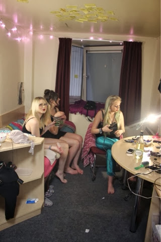
Me and Joe went onto experimenting with our first scenario. We did a group of girls getting ready for a night out. I think they look good to get the idea of what we want to do. But I think for our future ones we need to take them all from the exact same position and angle. As we felt like the over all image would look better if they all have the exact same composition. A good example of what we want it to look like is as if you've opened up the front of a dolls house and can see all the rooms from a front view.


Next, after taking them practice photos me and Joe went onto taking the photographs for the main character that is getting annoyed by the surrounding noise. For this set of photographs we took careful consideration into the composition. Also, we thought we could include props to help emphasise his frustration.


The lighting on this image is awful. The ones with the curtains shut were better.


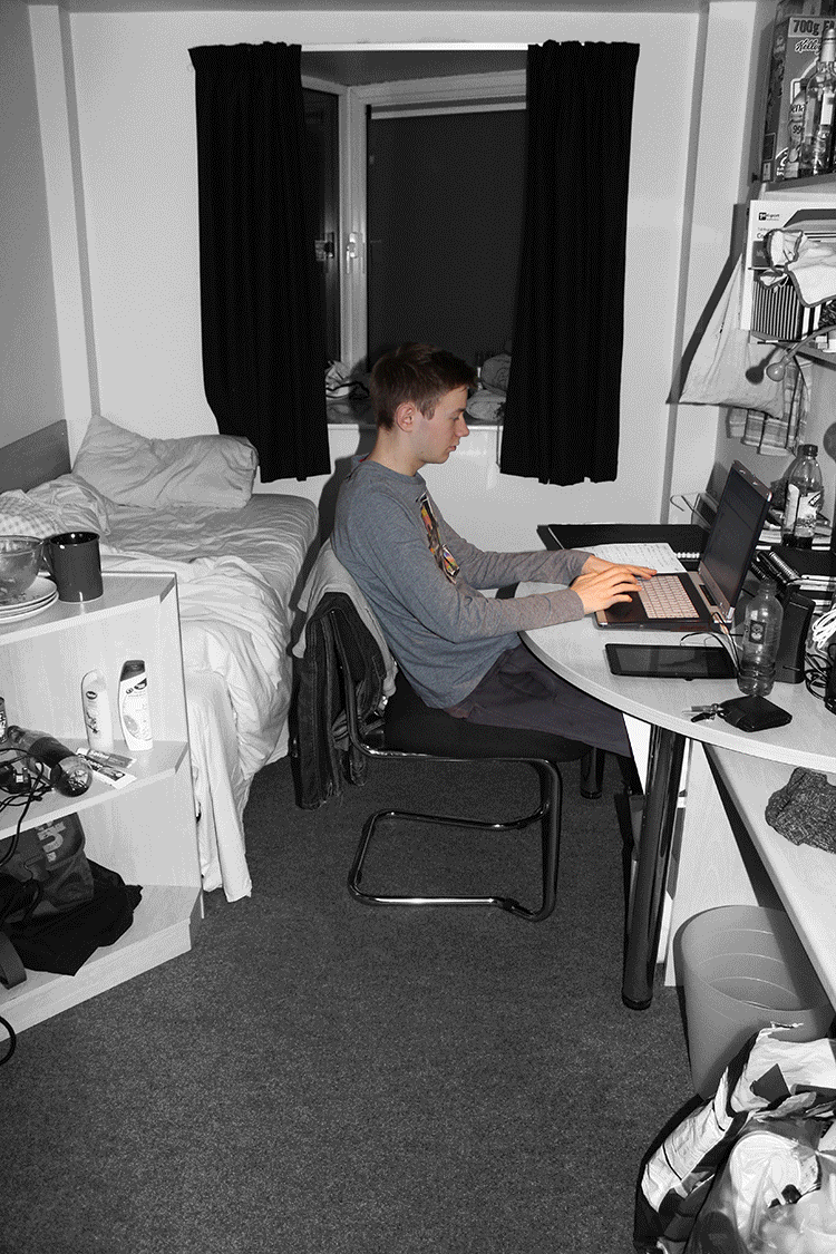
This time me and Joe decided to re shoot the photos of Aaron. These are much better; we took them all from the exact same position with no daylight affecting the quality. We got him the look frustrated and we wanted him to face the different directions so when it comes to the GIF we can go from room to room using the direction of where he's faces as a transition to the different rooms. We thought to involve props like the umbrella and the headphones to emphasise his anger.


Next we wanted to take photos of a 'lad' we thought we'd get him to be lifting weights as this is quite a stereotypical activity for a 'lad' to be doing. However, we then thought that him just lifting weights isn't a noisy activity and wouldn't cause an annoyance. Therefore we decided to include his laptop and speakers within the frame.


Then me and Joe thought it would be a good idea to have a completely random photograph. We thought that this would add humour to our GIF. I think that these went really successfully. We were stuck for what to use to tie him up but then found out my tights worked really well.


For the next one we did a shoot with Hannah trying to portray a stereotypical musician practising in her room.


I think that these set of photographs went really well. They really show the frustration in this person and that they would be creating a lot of noise playing on the game. Possibly shouting at the screen.

We began by taking the photos of him facing that way on the floor but then we thought that it would look better if he was facing towards the camera so you can clearly see what they photo is trying to illustrate. Also, we thought we'd emphasise the fact he has come in drunk by scattering some cans around the room.


I think that this last image worked the best as you can really see his drunken struggle to get up.
.jpg)
This is our final poster. It is different to how we originally thought it would look like but editing the photos took longer than we thought and then when composing them together turned out harder than we thought. Possibly if the rest of our group were there to help us out they could have done some of the editing too. However I am happy with how the final poster looks. We played about a bit on Photoshop and came to the conclusion that the images looked great in black and white and just the main focus of where the noise is coming from left in colour to amplify them and make then stand out against everything else. Another reason we did that was because we found with the photograph of Joe his hair blended into the curtains too much so this made a good contrast too.
No comments:
Post a Comment