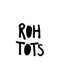
I have been thinking a lot about what the logo for my toys will look like. I had a go at making some the other week but I wasn't happy with any of them really. So I decided to play around with making some hand written logos. I wanted it to have the same feel as the ROH NOH logo, so I have used a similar thick black pen and capital letters.
This is the one that I have selected out. I have tried it out with blacked out parts too, similar to the other tests that I did. I'm feeling a lot happier with these ones. I like the first or the second one the most, I think before choosing I will gather some opinions from other people.


No comments:
Post a Comment