I then looked at a few images that I could possibly use. But after looking at a few reference materials I wasn't too sure about this idea and how it would work.
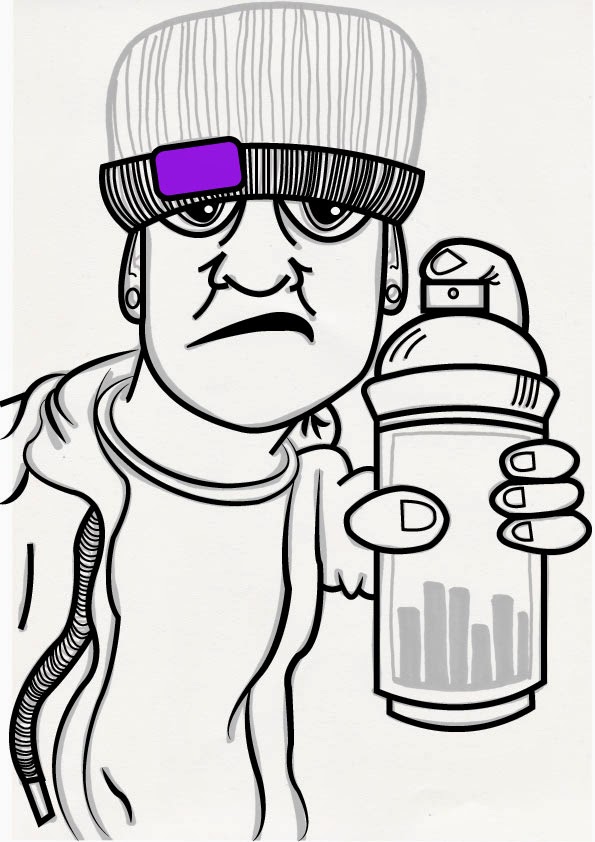
First I drew out my image using a bit of reference from some photographs of friends I have. In the final drawing I thought there was too many lines within the hat but liked everything else. So I light boxed my image and drew it again without as many lines. I wanted the final image to look a lot sharper and cleaner than it is so I scanned it into the computer and placed on illustrator.

Using the pen tool I went over my image creating straighter and sharper lines. I also found a way of making the lines different thickness' which I thought created a great effect on the jacket. I decided not to have the extra lines on the front of the spray can as I don't think they're really necessary.
After creating the outline on Illustrator I then went onto Photoshop to add in the colour. I thought I would try using the Wacom tablets as I have never used them before so thought it would be a good opportunity to have a go whilst its the holidays and no one else is using them.I actually really liked using them. I found it quite difficult adding in shading and got a bit carried away. I then tried blending the colours together but it wasn't blending very well. Plus, compared to the flat background I don't think tone worked too well and looked better as a flat image.
Because I have gone back home now and I don't have illustrator I thought that I could scan in my work and try out a few different colours using my pro markers.


After testing out some colour ways I realised I liked having a minimal amount of colours compared to the first one I did on illustrator with the greens and purples. I much preferred having the red tones and then having a big contrast in the can so that it stands out more.
I've come back to Leeds and gone back to my Illustrator drawing and tried out the new colour way that I had done using pro markers. Though I have tested out some different colours to use for the can to see what makes it stand out more.

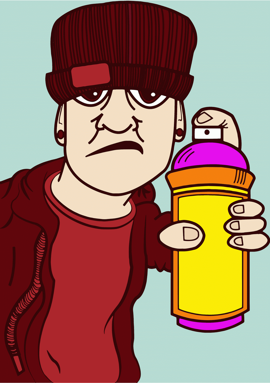
Going back to basics with colour theory I found that the purple and yellow worked well to create a bold contrast. Also after playing around a bit I found that I prefer the look of having dark red lines rather than black lines. It just links in all the red tones together well without having harsh black lines that break everything up.
I think that it all blends in well together using orange for the middle colour it makes it more ascetically pleasing to the eye and makes it less harsh to look at but still have a contrast against the red tones.
This is my final outcome. I am quite happy with the final image. However, I think that this has been a bit more of a learning piece for me. I am still very much getting used to using Illustrator and Photoshop and can feel myself getting more confident with them and learning things along the way. I am happy that I had a go at using the Wacom tablets as I have been very nervous about having a go on them and now feel comfortable with using them in future projects. I did find it frustrating not being able to get on with this at home due to not having the programmes. I think that this could have more detail and work put into it and would've liked to of had go but think that this does work well with being quite a flat image. I feel now looking back that the can should've been bigger to create a better sense of depth within the piece. I maybe should've had a go at some of my other ideas before jumping on to this one; though I knew I wanted to use the computer and I worry about how long I take so I didn't want to waste anymore time. Overall though I am quite pleased and just want to keep trying so I can improve more.


.jpg)
.jpg)


No comments:
Post a Comment