Tuesday, 31 March 2015
Tuesday, 17 March 2015
Wednesday, 4 March 2015
Small Mock Ups
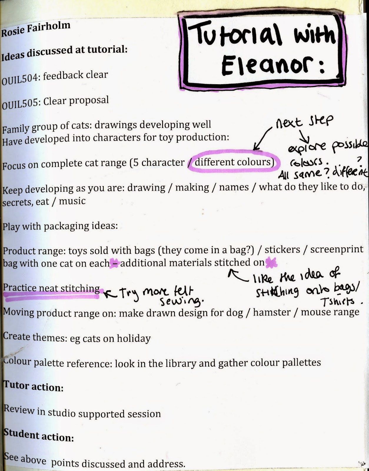
Using my character drawings I have made some small mock ups so I can get an idea of what they will look like. I used felt to make these mock ups however for the final I would like to use fleece like how Ugly Dolls are made. I used felt for these though because its a lot cheaper and its only to get an idea. I also hand stitched these so I want to try out with the sewing machine next as I am not sure if hand stitched looks a bit too messy. I still haven't decided which colour thread to go with yet. I used red to begin with as then it's not bringing in another colour to the equation. But I do like the purple thread in the second one as it brings in a bit of a contrast.
Colour
I have progressed to using colour now. Going with a similar feel to the range of Ugly Dolls I want to stick to a minimal amount of colour. I have drawn out different possible eyes that I could make as I think that they are a really important part to my character as it changes the whole look.
Updated Timetable
Now I have a better and clearer view for the next few weeks. I have added extra notes onto my time table. I am finding this really useful having done this in the front of my sketchbook as it is easy to refer to. I also have printed off a bigger one for my folder too.
Monday, 2 March 2015
Software Workshop 3
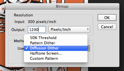
Bitmap (only use this method if working bigger than A3).
- No shades of grey
- No smooth edges
to avoid jagged edges you higher the resolution. Increase to 1200 pixels/inch to maintain the quality of your image.
Click on Halftone Screen. The size of the dots will determine the tint.
This will appear. The frequency shouldn't be higher than 65.
You can pick which shape the dots appear. Round is most common.
Angles:
15 = 1 Colour
75 = 2 Colour
105 = 3 Colour
155 = 4 Colour
Select - Colour range - Selection Preview and can press cmd to see colour. You can change the fuzziness levels. Click on the image to the area of colour that you want to work with.
Solidity = Simulates transparency
Channels - New Spot Channel
Change levels to make high contrast and get rid of grey areas.
(Adjustments to channels)
Double click on the channel.
Change to spot colour
Change the colour to black
C = 0
M = 0
Y = 0
K = 100
Expand - Change to 3 - then you will be able to see a slight overlap.
Then with eraser rub out any areas you don't want.
Double click and change the Solidity to 100% whilst on the light yellow and then drag the Light yellow channel bar above the black so that the black is nearest to the front.
NEW IMAGE
Lock in transparent pixels.
Edit - Fill and change background to black
Or click D which changes to black and click alt delete and will change the green to black.
Copy the Green Colour in the colour channels and then turn the copy into spot colour by double clicking and change to black and change the solidity into 100%. Then change the name to say 'Black Spot' just so there isn't two blacks.
Then on the adjustments change the levels so that there aren't any greys and the lines are bolder.
Keyboard shortcut: hover mouse over the colour layer and then click cmd which will select all the non transparent pixels and then click the layer.
hover over the layer - cmd shift - add layer
To change colour or add texture to other layers.
First layer with drawing has to be on transparent then next layer apply colour over the areas that you want in that colour/texture and then hover your mouse over the border between them two layers and click alt and that texture/colour will be applied to the first layer.
Subscribe to:
Comments (Atom)


